ABS Wavesight
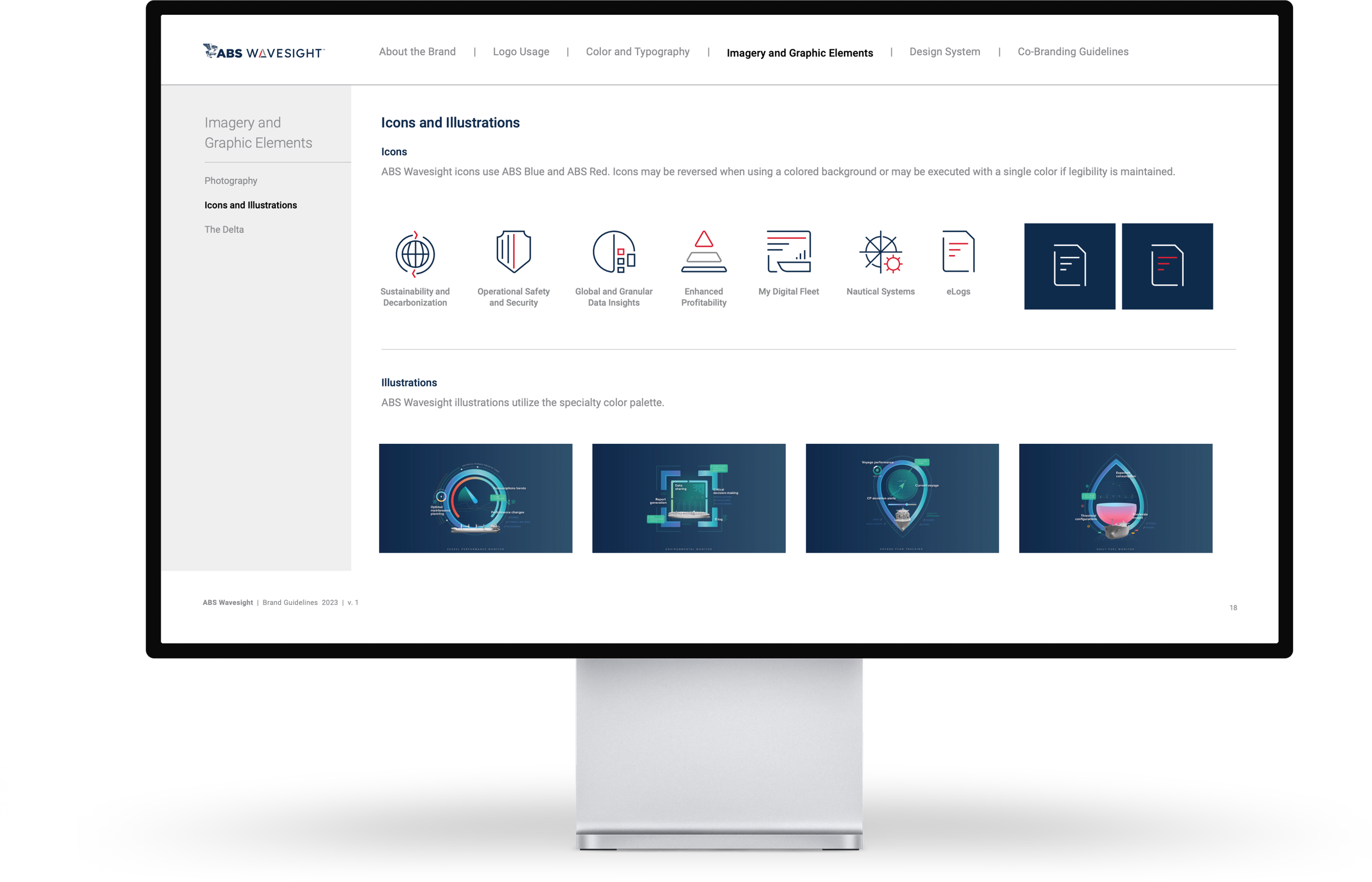
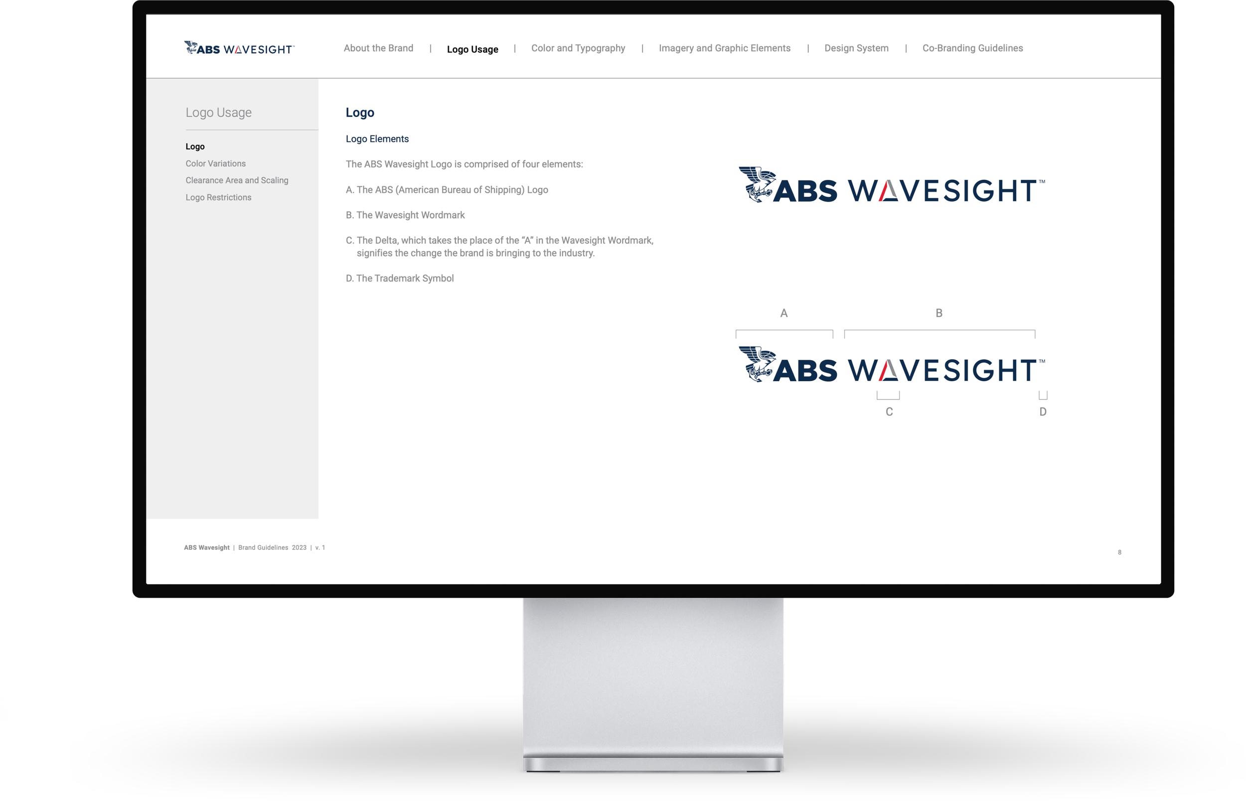
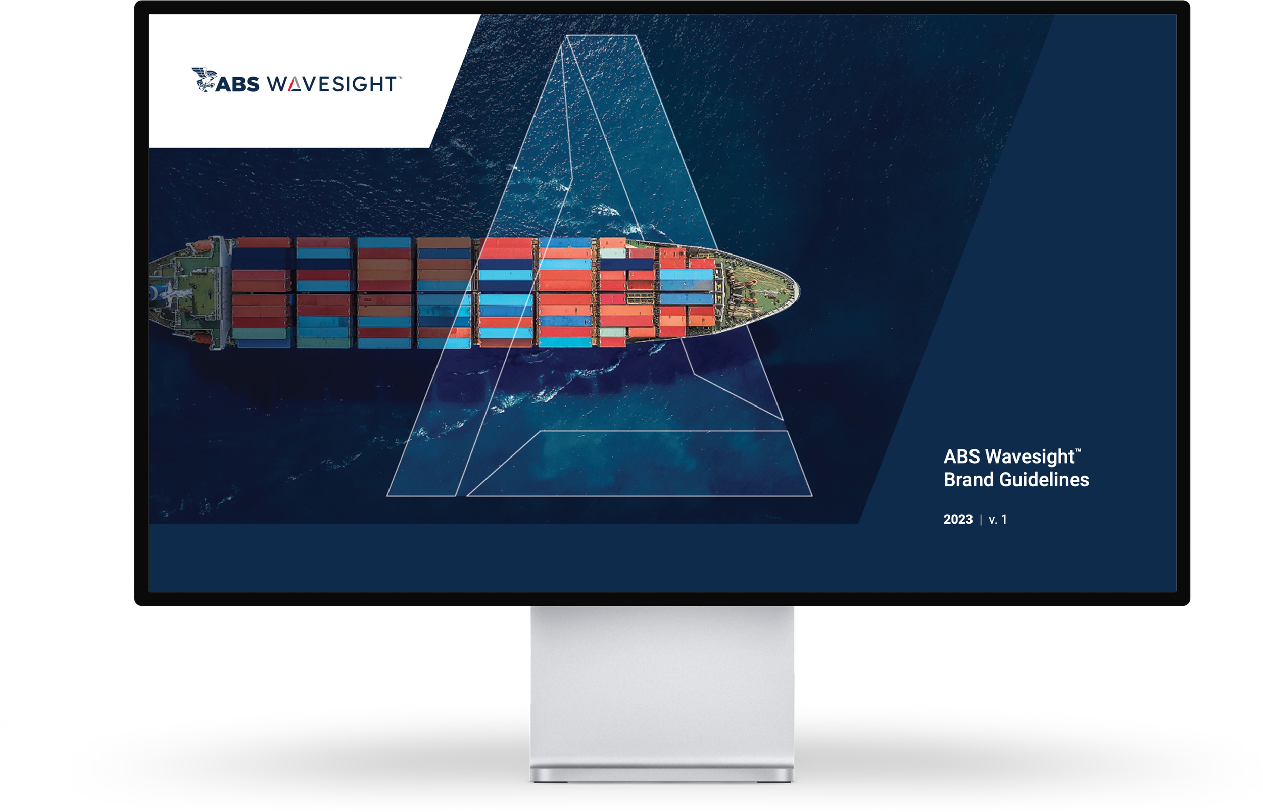
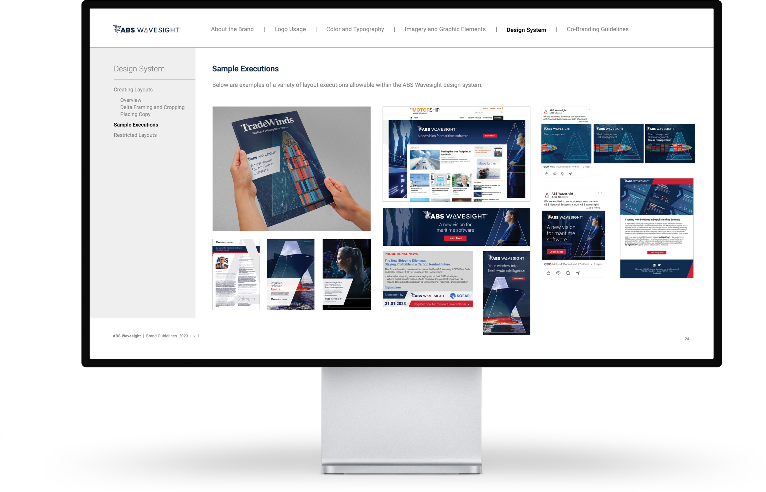
The ABS Wavesight Brand Guidelines emphasize the Delta as a symbol of change, using imagery and negative space. The color palette aligns with the ABS parent brand through primary, secondary, and specialty colors. Typography features a primary font for professional use and a secondary font for digital. Photography represents the industry and customers, while icons in ABS Blue and ABS Red improve legibility. Illustrations utilize the specialty color palette for consistent ABS Wavesight branding.
Client
ABS Wavesight
Year
2024


